

Don’t you love it when you open a new product or App and set it up. Then you can’t help but smirk because it was just so fun. Or simple. Or interesting? I definitely do.
On the contrary – what’s the worst way to get started with a new purchase you’ve made (whether or not you paid for it)?
How about you open up the box and the directions to assemble your new dresser are in every language except yours? Or the illustrations leave out a critical step? Or it’s missing a screw?

What are the first sensations you experience? Frustration, tension – even anger.
All this, over something you just PAID for! First, this asshole takes my money [or time], and then has the nerve to piss me off!
In this discussion, we’re talking specifically about user experience with software and mobile apps – but these concepts really apply to any product or service.
First – Product Managers: Build for your Users, Not for You
Often times, as product managers, we strike inspiration and feel compelled to build.
The problem is: a lot of really “cool” concepts we come up with have great novelty, while their usefulness [at scale] may be marginal.

So as product managers, we need the ability to see beyond novelty, and understand whether this is a feature people have explicitly asked for, OR for whatever reason, you have proof this will improve the User Experience (UX).
1) People aren’t using your product because they want to stroke your ego
Don’t assume that because your product is “cool” that will do the trick for acquisition and retention.
They’re using your app because it provides some explicit utility, either emotional or tangible. So give ’em what they want. And more importantly, don’t make them feel bad for not knowing how to use your app.
In the case of Vea Fitness – the iOS app my team and I run, people are coming for 2 clear utilities:
- To improve their health and fitness life
- Get rewarded for it
They’re NOT using Vea Fitness because they want me to have their email. Or because they think the idea is cool. (That may get the initial download, but it does very little for their long-term engagement).
So make sure that when you design the user experience, it places their goals ahead of your own. In the case of Vea, make it easy to start a workout, track it, and get rewarded – starting with the first time someone opens the app.
Take Aways
- Prioritize the user’s goals ahead of your own business goals.
- As a first time user – my goals might be:
- Learn to use the app
- Get a workout
- Redeem my reward
- BUT – My business goals as a product manager might be: have a user redeem a reward and make a purchase.
- If I only focused on those specifically, I’d neglect the fact users need an understanding of Vea Fitness before committing to using it (or even being able to use it).
- Effectively, I’d skip steps 1 and 2 for the user but expect them to reach step 3
- It’s vital we appreciate and build for the prior
- As a first time user – my goals might be:
2) Teach Them How to Make the Most of the App Experience
This is one vital lesson we learned at Vea Fitness: just because your app looks and functions like apps they’ve used before, it doesn’t mean they know how to use it.
Some of our most valuable learnings from our Beta release related to: how people didn’t know what do once they’ve opened the app. While Vea is a really simple app, and only has a few screens – it’s still new to them.
When you own a product, it’s easy to become snowblind – or overly acquainted with the experience. We can’t let our own deep understanding of our own product cloud our judgement of what the user wants.
Take Aways
- Make every user experience guided and graceful. Don’t assume they know how to use your app like an expert.
- Get the user started with their first experience the first time they use it.
- Often times, the user downloads your app the moment they’re planning to use it
- Even if they don’t, it can’t hurt to teach them on the spot.
Here are a few screenshots of our new First Time User Tutorial for Vea Fitness:


We give the user 5 total steps that will make them feel like an “expert” user by the end.
3) Escort Your User Through Their First Experience
Think back to the last time you downloaded and started an app – did you immediately know how to use it?
More than likely, the answer is:

Give them directions, and escort them directly into their first experience. The user can always opt out of the tutorial if they already know how to use it.
The Take Away
- For Duolingo, that means taking the user to their first language lesson.
- For Vea Fitness, that means handing the user a recommended fitness activity to complete, even if it’s a really short/easy one.
- For other apps, like a cool one I discovered recently called Blacktop that helps you set up pickup basketball games; one might help the user set up their first pickup game for friends to join.
4) Don’t Do Unnecessary Shit
Thank about apps that require you to create an account/submit email before using. Why do you need my email before I can get driving directions to my destination. Or before I can start learning a new language?
Is there something I’m missing? How is my email tied to that experience at all? It seems irrelevant as a user.

If I’m downloading an app that finds my friends based on my email contacts – sure, it makes sense you need my email.
Time and time again – the user gets upset when they need to create an account for an app they don’t even know if they want yet.
Further – if the user doesn’t specifically state “I’m looking to get email marketing from you,” it’s really frustrating when they get an email minutes after sign up. For me personally, I just unsubscribe at first contact if I feel I was subscribed to a list I wasn’t ready for.
One outstanding example of a graceful FTUX is in the Duolingo. Duolingo’s First-Time User Experience (FTUX) looks something like:
- Hello Jonathan!
- Pick a skill level
- Pick a daily goal for your French lessons
- Get started on your first deck
- Once you complete your first language lesson, then you can create an account to save progress
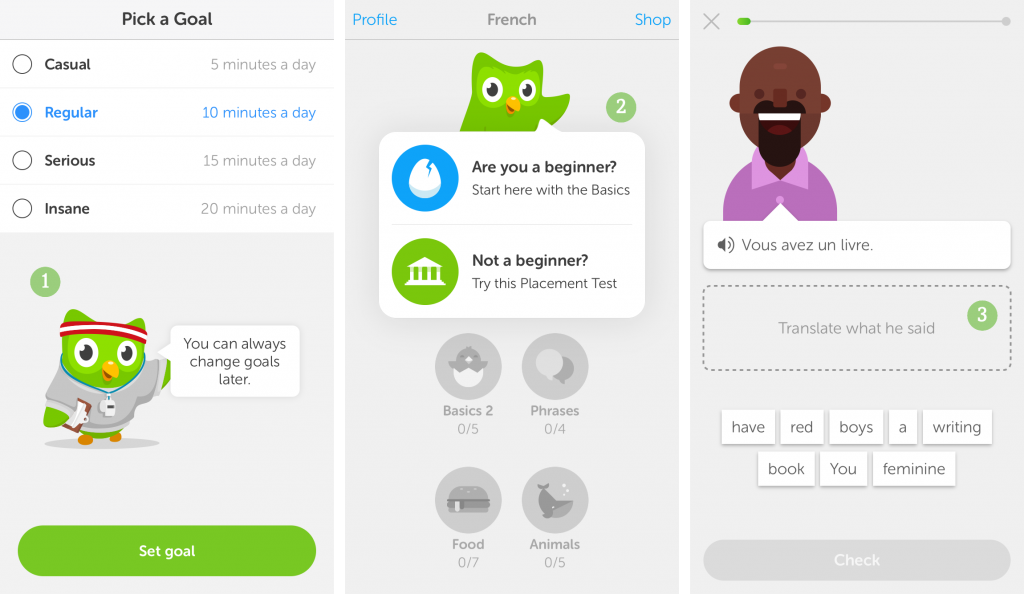
The user has a chance to walk through a whole user experience, which awards you badges/achievements along the way and shows the user exactly what they’re getting into using Duolingo; enabling them to make a conscious decision to sign up with email, if they enjoyed the experience.
The Take-Away
- Don’t require unnecessary information from the users, like emails up front. If you must require something sensitive – tell them why you’re asking for it (in a smart way – don’t shoot yourself in the foot)
- Say you need their location to track their run, you might prompt “We’ll need to turn on GPS in order to track your run”
- Tactically, you can push your login screen until after the user has gone through the first time user experience
- There are a few exceptions where you’ll need their email up front, but for most of us – it’s OK to ask for it afterwards.
Thanks for reading and hope you gained a lot from this personal experience of mine working on Apps.
Talk back: What’s your favorite trick for making your user feel that warm and fuzzy feeling?
This is a Contributor Post. Opinions expressed here are opinions of the Contributor. Influencive does not endorse or review brands mentioned; does not and cannot investigate relationships with brands, products, and people mentioned and is up to the Contributor to disclose. Contributors, amongst other accounts and articles may be professional fee-based.