Posters are the most conventional medium for businesses, political parties, marketers, administrative bodies, and individuals to convey their messages to the target audience. In olden times, we used to make handmade posters, but now we have the scope of making high-end digital printed posters of any kind. To make a creative poster to promote your services, products, or marketing materials for your business, you need to understand and follow a few important things as below.
Size of the Poster
One of the most critical aspect elements while designing a poster for printing is the poster’s size. There are different sizes available, and posters can be made in any imaginable sizes now, whereas the most common sizes are:
- 5-inch x 11 inch
- 11-inch x 17 inch
- 22-inch x 34 inches etc.
You can also design large format poster prints, which are 24-inch x 36 inches. Even though the posters are popularly designed in a vertical orientation, you can also consider horizontal orientation if that is the need.
Posters Need to be Made Straightforward
If there are too many forms of colours, images, or graphics used to convey your message on a poster, it may be confusing for the viewers. An expert designer may only consider only minimum possible elements to have the viewers focus rightly on your message.
Readability From a Distance
Posters that are visible from a distance tend to grab more attention. The information on posters should be conveyed the right way to the viewers as people may not come too close to your poster to understand the content. Usually, text on poster printing is displayed in three layers.
- The top layers may consist of the header, which is big and bold. This should be made as catchy as possible and should draw the viewers’ curiosity to read further.
- In the second layer, you need to include the message text with the details. You must keep the primary information and the call to action, here. Provide all relevant details in a font size that is at least half of the headline’s size. If you want to have a larger scale poster, ensure that this layer t is separated from the headline.
- The bottom layer is meant to include other details of minor importance, which can be in smaller fonts.
Maintaining Enough Contrast
People usually do not have much time to pay very close attention to all things around them. The attention span is also too short for people nowadays, so they do not want to look at a poster so closely for a longer period to understand things. If you maintain elements with proper contrast, it can easily catch the viewers’ attention towards your poster.
Do to make the poster content easily noticeable, try to make a big difference between different elements. You may take care of the contrast of the poster using light and dark colors wisely. Pure white and pure black offer the ultimate contrast, and you may also try to incorporate dark text against a light background for better contrast.
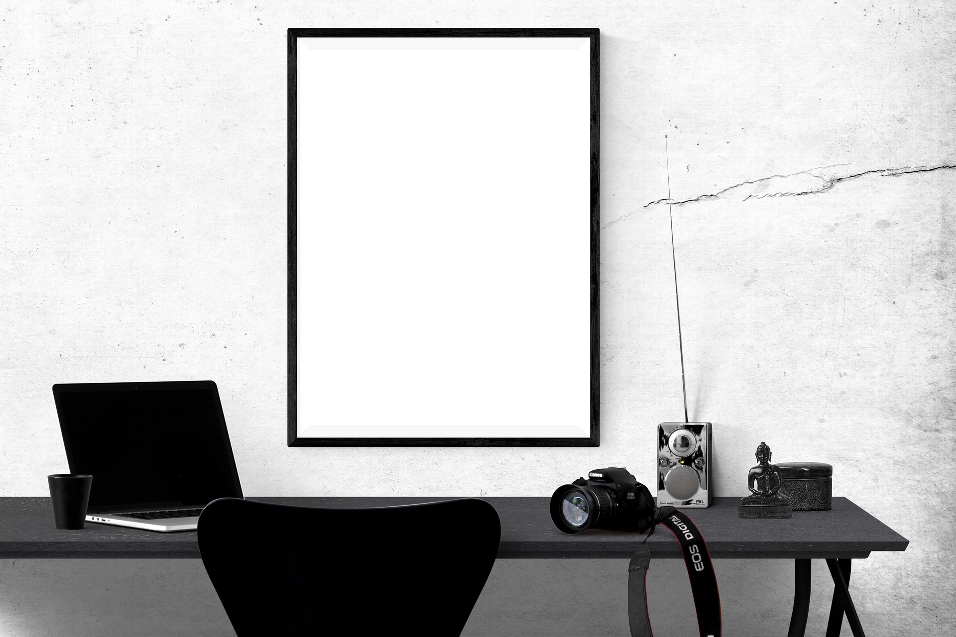
Location of the Poster
Another important thing to consider while designing posters for printing is where they will be placed. You need to know that the poster size, color, and orientation must be decided based on the specifications of the location. For example, if you want to hang the poster on a light blue wall, then you may want to use a contrasting brighter color for the poster design.
Many online stores also offer custom poster design and printing services, which you may choose by carefully evaluating the benefits and drawbacks of each.
This is a Contributor Post. Opinions expressed here are opinions of the Contributor. Influencive does not endorse or review brands mentioned; does not and cannot investigate relationships with brands, products, and people mentioned and is up to the Contributor to disclose. Contributors, amongst other accounts and articles may be professional fee-based.