

[playht_player width=”100%” height=”175″ voice=”Richard (en-US)”]
You walk into a clothing mall, give a little look at different shops, pick a couple eventually, scan the clothes, and find something you like. If it fits right, if you feel comfy, then you most likely are going to buy it. Sometimes, you might take a friend with you, someone with a better style, to guide you through the process. You might even tell yourself, “I know nothing about fashion, so you stop me when I fall in love with a pair of pants that are not in trend right now.” And that’s okay. We all want to look stylish. But, remember Phoebe from Friends? She always stood out because of her sense of style. And even if at times she would wear something ridiculous, we still adored her. Why am I telling you all this?
Creating a logo when you don’t have a designer’s mind can be very tricky. You might come up with something you absolutely love and forget to count the option of your target audience in. You could also craft a logo taking the hot trends into consideration but end up ruining the bigger picture. And, I know that there comes a time when you really don’t want to hire a designer to do all the job for you. Besides the hours and even days you’re going to spend sharing with her your vision, you also don’t want to spend too much money. After all, there are so many great online logo makers. And who are they for? They are for you. And you can create a great log; don’t doubt yourself. You might just need a little bit of advice. Let’s dive in.
It’s Unique, but How Unique?
When you start adding the icons and the shapes and don’t take any other logos as an example, you will think that the logo you came up with is totally unique. But trust me: it’s almost impossible to create something truly unique. That’s why you should always, always, always check it against other logos. Making sure that your logo isn’t infringing on other trademarks is an important step you, as a non-designer, might forget. After all, it could put an end to your business even before it takes off.

Stock Vector Graphics in Your Logo? You’re in Trouble!
You found something that looks great and want to incorporate it into your logo design? Great. But make sure not to put your company at risk. Keep the laws of copyright in mind. Here’s something you should tattoo in your mind: your logo should be unique and original, and the licensing agreement should be exclusive to you. If you use stock art, you’re breaking both rules.
Now, you’ve checked and you’re not breaking any laws. Good. But did you check to see if it’s similar to someone else’s logo? You know what’s going to happen if you end up coming with something very similar? First of all, consumers are going to associate you with the other brand. Second of all, the public might think you did that intentionally, to use the other brand’s reputation to gain awareness. And you don’t want that, right?
So, let’s assume you’ve got your super unique logo. It’s time to protect it with a trademark. They most certainly cost around $300. And it’s an investment you just have to make into your brand new company.
Colors and Our Minds
Colors have stronger impacts on our unconscious than we actually know. First of all, colors are what catches our eye. Then, it’s because of the color that we make up our mind whether we are interested in the brand or not. Some colors simply push us back. Some are very inviting. Let’s take orange: at first, you might think, well who actually loves orange? But it turns out that orange is the best color for encouraging people to click. And that’s for your CTA buttons. Your next choice should be red, even though some believe the color is associated with aggression.

But that’s not all. What’s more important is the connection between your brand and the colors of your logo. What’s your company about? What does it stand for? You can’t create a logo for a children’s clothing shop and give the logo the color black. It just won’t make sense and won’t speak to your target audience. But giving it a couple of happy colors that bring positive associations in people’s minds will do just fine.
Another interesting fact that you might not know: you shouldn’t rely on color too much. It’s one thing to add color to your logo design and make it more appealing. But it’s another to rely on it completely. It’s always better to start in black and white, making sure the logo looks good in those colors, too. Because you never know if you’ll be forced to use your logo in only one color: let’s say the print is only in black and white. So make sure that the colors don’t really affect your logo’s identity.
Format: White Background, Black Background
So you have your mind set on the design and the colors. The next thing you should think about is its format: remember that, if your logo looks good on a white background, it’s not going to look as good everywhere else. You’ve got to test it. So make sure to see how your creation looks like in a couple of different formats. Also, using a logo maker that lets you produce a responsive logo helps.
Keep in mind: when your business takes off, your logo will be displayed on the side of a building, on your website, someone’s iPad case, etc. Make sure it looks flawless in every format.
Too Many Vegetables in the Bowl
Content creators, especially the ones that have poetic minds, like to make the text they write overly descriptive: that works great on their end at times. Salespeople like to overload their clients with too many details about the product they are selling, starting from its features to its benefits.

But when it comes to your logo, you’re better off with simplicity. No one likes an overly complex logo: first of all, it’s hard to remember. Then, it’s not catchy, and it won’t look good printed or in smaller sizes. Just imagine looking at your highly detailed, overly complex logo from afar: you won’t see half of the details. And that’s just not cool. Just take a look at the most iconic logos in the world: Nike, McDonald’s and Apple. They are as simple as they can get, and everyone recognizes their logos.
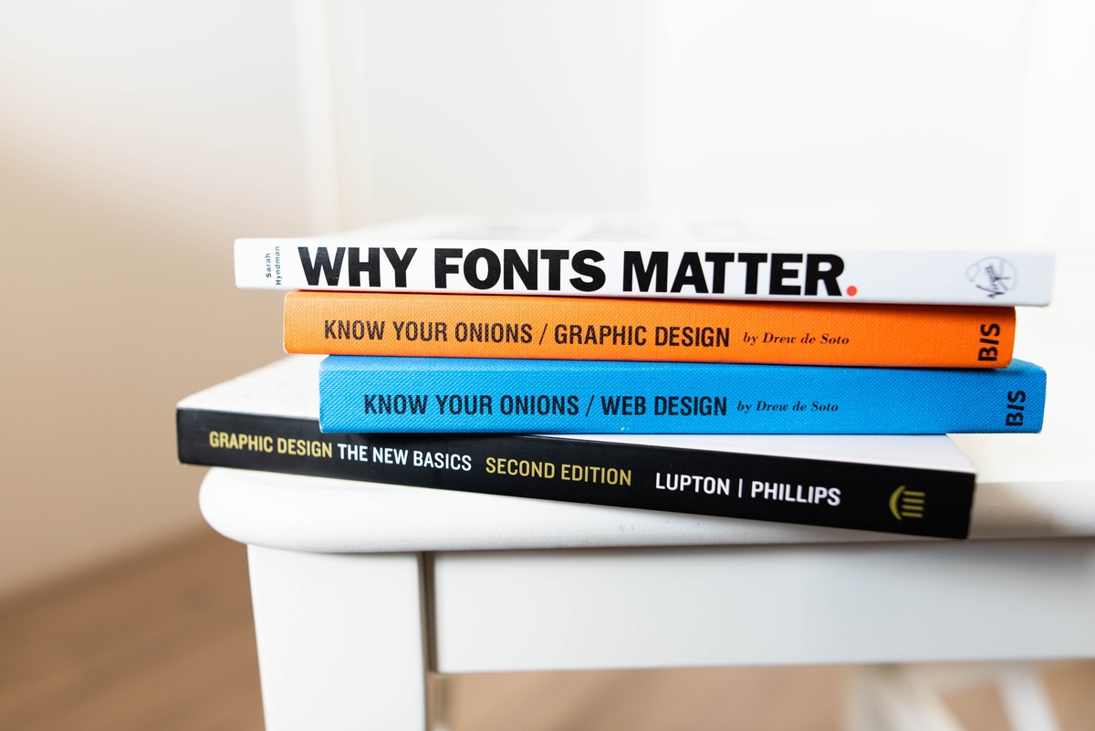
What Can Make or Break Your Logo? Fonts!
Well, not only fonts, but they’re pretty important when it comes to the success of your logo. Choosing the right font can be a pretty tough task, but it’s all about matching the font to the style of the icon you’re using to create the logo. And here’s the tricky part: if they match like twins, that’s no good, because the icon and the font will complete each other and won’t grab attention. On the other hand, if they are too different, your audience won’t know where to focus and will get confused. So what do you need to do? Find the perfect balance. But you’re not a designer? How will you know what the perfect balance?
There are professional font foundries, like MyFonts. They offer way better typeface options than the ones you can find on every website. It might not be free to download the font you used, but at least it won’t be too corny.
If you thought we were done talking about fonts, you were wrong. There’s another mistake that you might make, and I won’t let you: using too many fonts when creating your logo. The best you can do is use a maximum of 2 fonts, and that’s it. Don’t go crazy with this. You can go crazy with your Christmas decorations, but not with fonts in your logo.
If you don’t want to confuse your viewer and want to help them recognize your logo immediately, stick to fewer fonts. After all, you will improve the legibility of your logo design and enhance brand recognition with it.
What’s Hot at the Moment? Let’s Go With the Trends?!
No, no, no. You can only follow this sentence when it comes to shoulder pads and leather pants. When it comes to your logo, relying too much on the trends won’t work. You know why? Because you want to create a timeless logo. If you focus on current logo trends, you will put an expiration date on your logo. Sure, you can check them out for inspiration, but don’t take them as a rule.
Your Logo Is Not for Yourself
I think I can’t state this enough: the biggest mistake you can make when crafting your company logo is designing it for yourself rather than for your client. It’s so easy to get into it, forget who your target audience is, what they like, and where they hang out, and end up imposing your own personality when creating your logo.
Here’s how you can make sure to never make the mistake: put your ego aside. I know, I know: we all think that our ideas and our thoughts are the best. But stop for a second and realize that what you’re creating is not for you; it is for your company and its clients.
When you want to add a font, a color, a shape, ask yourself: are these appropriate for my business? Frankly, that curly font doesn’t go with your law firm.

When You Think You’re Done, You’re Not Really Done
Now, you’ve got yourself this amazing creation you’re so proud of. Well, don’t be yet. It might actually be brilliant. But it also might be only in your head. So leave the logo aside for a couple of days and then come back to it. You might have some new ideas on how to improve it.
Test It: Get Some Juicy Opinions
You already have your perfect consumer in mind, right? So you need to know how they will respond to your logo. For that, stop all the guessing games and do public testing. Approach a test group, show them your design, gather the feedback, and make some improvements.
Well, that’s it. Use these when creating your logo and, hopefully, no one will know it was crafted by someone with no designer skills. After all, that’s the goal, right?
This is a Contributor Post. Opinions expressed here are opinions of the Contributor. Influencive does not endorse or review brands mentioned; does not and cannot investigate relationships with brands, products, and people mentioned and is up to the Contributor to disclose. Contributors, amongst other accounts and articles may be professional fee-based.