Let me paint you a picture. Me and you, we’re standing at a bus stop, waiting for number 37 to pick us up. A BMW rushes in front of us, splashing the dirt and rain all over our shoes. Me and you, we’re in the same reality, right? Do we have the same reaction to the just-occurred event?
Probably, but different things go into our heads: I think of my brand new Vans getting ruined, and you think of the time on the beach with your family, with the ocean waves on your feet. But we’re in the same reality, right?
Let’s get a little technical. The study of thought, learning, and mental organization is cognitive science. It draws on aspects of psychology, linguistics, philosophy, and computer modelling. With that in mind, cognitive scientists study intelligence and behavior with a focus on how nervous systems represent, process, and transform information.
And not to bore you with too many terms, I will say the last one: the fundamental concept of cognitive science is that “thinking can best be understood in terms of representational structures in the mind and computational procedures that operate on those structures.” If you’re a bit lost right now, it’s okay. I promise this all will make sense at the end. And if you’re curious, let’s dive in and understand how cognitive science can help developers and designers create better user interfaces.
What is reality? Some of us think of reality as an independent entity. Some of us don’t. I mean, even if an external reality does exist, how can we ever know? Visual objects in the outside world trigger some visual processes in our minds, however everything that we perceive and know as our reality is the end result of this process. So, we can make a conclusion that reality is filtered and affected by the weird and creative powers of our mind, thoughts, and fantasy.
Examples are always the best way of imagining and understanding, right? Imagine a colorblind person who sees the world in all shades of gray. The person has a different reality, right? Or maybe not: he may live in the same reality but perceive it differently.

When you close your eyes and try to imagine something specific, it might not come to you that easy: the shapes, the colors, they all may seem flat. But when you read a great piece that has all the rich and vivid details of the world, for a second, you can imagine it all, right? Well, just like that, talented designers can portray anything visual with their paintbrushes or tablets. In art, the visual stimulus is provided directly to the observer. And that, in fact, is the closest link we have to experiencing another person’s visual reality.
As we know, realities are not universal and rather are a byproduct of different cognitive processes. Never thought I’d say this, but that comes in handy when designing user interfaces.
Within milliseconds, our minds decide where to look, identify object boundaries, images and associate them with meaning. So much goes on in so little time. That’s why our conscious brain is only working with what our automatic system has perceived, not the real thing. And so we get overwhelmed with choice and, most of the time, prefer the known.
So, how can we use what is known to our brains and create better user interfaces?
Vision, attention, and emotion: they all go into the process of people perceiving things and making connections and decisions. Let’s cover a couple of them.
Vision
Familiar with Gestalt laws of grouping? They have a big importance in the visual representation of your website. Let’s go over the two of them.
Law of Proximity
The law of proximity states that humans perceive stimuli that are close to each other by grouping them. At the same time, stimuli that stand far from one another are parts of two or more different objects. The principle of proximity lets us group elements together into larger sets and helps us gain an understanding of information much faster. For instance, if there are a dozen groups of dots on a piece of paper, our brain perceives them as clusters of dots, instead of identifying every single one of them.
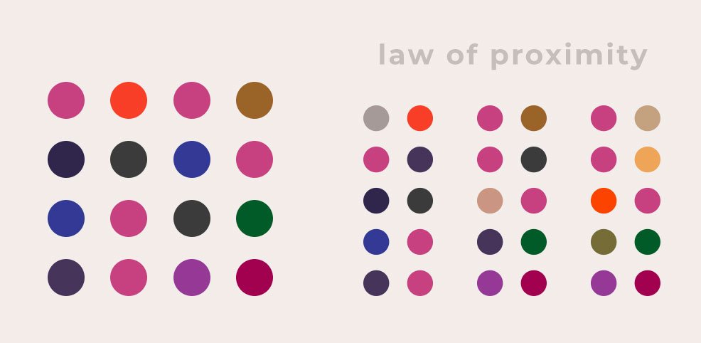
Our minds are very good at finding patterns. By introducing white space we perceive columns. So you don’t have to draw boxes around everything to cremate grouping: just a little bit of white space is what you need.
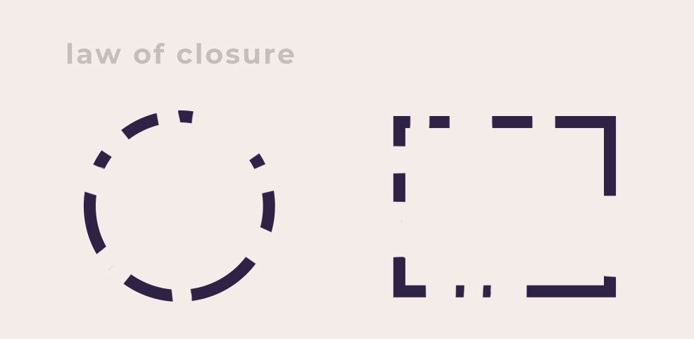
Law of Closure
Gestalt psychologists believe that the brain tends to perceive forms and figures in their complete appearance despite the absence of one or more of their parts, either hidden or totally absent.
So we complete forms mentally, very quickly. For example, you have a text field: you don’t have to draw an actual square and drive people to write the content in it: you can simply draw edges on the sides of your lines and their mind will complete it as a box. So the box exists in the mind even though it wasn’t really there.
Peripheral Vision
A study revealed some very interesting facts about peripheral vision. Imagine a test chamber: a person goes in and has no clue what the study is about. And there’s a tiger in the middle of the room. The study was about monitoring how long it takes for a person to realize there is a tiger in front of them. And it was about 190MS. And then, there is another test. A person, again, goes into a room and there is nothing. But then, a tiger appears. The interesting thing about this is that it only takes 80MS to see the tiger.
Now, how can you use this piece of information to design better user interfaces? Well, let’s say there is a notification on your website you want your user to see. If the notification is already there when a person visits your website, there is a little less chance of them noticing it, rather than when the notification appears after they are already browsing through your website.

Geons and Object Recognition
When we look at an object we immediately break it down to the geons that it contains as we’re perceiving it. And we do that with all objects: from simplest cup to a more complex vacuum machine.
That is because our brains recognize geon shapes faster: by breaking it down, we make it easier to make sense of the object.
In fact, we recognize geon shapes faster than icons. So if you want to put an icon of a phone in your website, a geon shape of a phone would be perceived faster by the user than an icon.
Facial Recognition
Did you know that if a group of people walked in front of you, you would recognize a familiar face in the crowd really fast? And you wouldn’t even have to scan all the faces. It’s different with text, though. When you receive an email, you go through all the names to find the person you’re looking for. But in the case of faces, we recognize them immediately.
So, to make your user interface better, having quotes on your website with the author’s faces rather than just names makes it easier for users to make a connection, recognize someone familiar. and consume the information faster.
Attention
You have a title of a blog post, let’s say. Do you decide to have the whole title in one line, making it a long line, or do you prefer to have the lines short and break the text down to two or three lines? It’s proven that with long lines we consume the information faster: it’s easier to read one line than a couple of them despite its length. But if you ask people, they will say that they prefer shorter lines, because it feels comfortable. However, we know that long lines are more efficient and optimal when it comes to sinking in certain information. So, next time you’re creating your user interface, keep this in mind.

Emotion
One of the most important emotions we want to enhance in our users is trust. As people, we are designed to make trust decisions quickly. Even when making a basic decision, like thinking to ourselves if we should eat something unfamiliar, walk next to a building under construction, we decide to trust or not to trust.
First impressions are very important when the emotion of trust comes along. When you go to a restaurant and see the chef, standing tall with his cook’s hat on, clean and neat: you make a first impression and that’s the moment you make a decision of trusting the food in that restaurant. It’s the same way in the visual world.
You want to read about finance and find two blogs. After a quick scan of the two websites, you lean towards one on trusting more than the other: and it’s all because of their interface. Let’s say one of the websites is in the color of blue. Blue usually reminds people of the sky and the ocean and they form a trusting emotion towards everything that is blue.
Well, that’s true except for some cases where, for example, a person drowned in the ocean as a kid. So you form a decision on which blog to trust and, as you get additional information about each blog, you start telling yourself made up stories to justify your original assumption. Let’s say the blog you trusted in the first place had a negative comment: you tell yourself that it might just be an angry person having a bad day.
Even though the color of the website and the one negative comment were only examples, I think you know what I mean. When creating user interfaces for your applications, websites, and more, keep in mind that first impressions matter a lot.
If you do rely on cognitive science and understand how people make decisions, what’s going on in their brains when browsing through websites, you’ll be able to create interfaces that draw attention, show detail, and make your user’s choice simpler. And if you’re a person who wants to create a website for themselves with the help of an online website builder, let’s say Ucraft, you’ll still need the knowledge of cognitive science to create a welcoming, easy, and useful interface of your website.
This is a Contributor Post. Opinions expressed here are opinions of the Contributor. Influencive does not endorse or review brands mentioned; does not and cannot investigate relationships with brands, products, and people mentioned and is up to the Contributor to disclose. Contributors, amongst other accounts and articles may be professional fee-based.