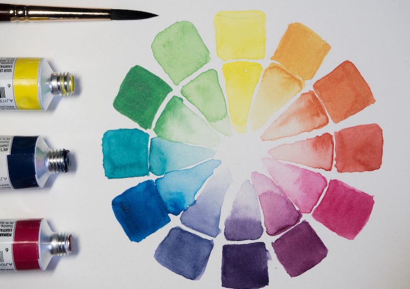
Did you know that the colours that you use in your printed poster – or any other printed marketing material you might create – will have a big impact on how consumers respond to your brand?
Each colour has a specific meaning and emotional associations that go with it, and if you know what you’re doing, you can use those associations to give your brand a boost and catch the attention of the right people that you want to reach.
Understanding the Psychology of Colour
Before you even set pen to paper (or open up that graphics software on your computer) to start designing, you need to establish the goals of your poster. What are you looking to achieve with this poster, and who are you hoping to reach out to? How do you want people to respond to your poster, and what do you want them thinking about your brand after seeing it?
Once you’ve established that, it’s time to start tapping into psychology and working out what colours you want to use for this design. The dominant colour that you choose will be the thing that people respond most strongly to, so choosing that principle colour motif is key here.
Some of the most common colours, and the emotional responses that they stimulate, include:
- Red: excitement, strength, love, sensuality
- Orange: confidence, success, brave, sociability
- Yellow: creativity, happiness, warmth, cheer
- Green: nature, healing, freshness, quality
- Blue: trust, tranquility, loyalty, peace
- Pink: compassion, sophistication, sincerity, sweet
- Purple: luxury, royalty, spirituality, ambition
- Brown: dependable, rugged, trustworthy, simple
- Black: formality, dramatic, sophistication, security
- White: clean, innocence, honesty, simplicity
The real trick is in being able to use these colours effectively in collaboration to create a killer poster.
An Analysis of Colour Theory in Action
Just about any great movie poster you’ve ever seen is also a great application of colour theory.
Taking the iconic Jaws movie poster as an example:
There are three colours that are dominant in the poster: blue, white, and red. Additionally, about three quarters of the poster is taken up by blue. You may think, “why on earth would a horror movie be dominated by a colour associated with tranquility and trust?”, but it’s in the application of the other colours that the blue is so effective. The blue, which is muted and low contrast, acts as a ‘neutral’ use of space, drawing the eye upwards to the powerful red (and all-caps) movie title. Red is the colour of strength and excitement, and combined with the dramatic font immediately promises the audience a wild, dramatic ride (and the shark at the bottom of the poster tells them what the source of that excitement will be).
The white, finally, is used to complement the title, enhancing the contrast to make the red stand out all the more.

(Image via National Trust)
Another great example of colours working together to set the tone for a movie poster can be found with The Exorcist. Here is a simple use of black, white, and purple to create a singular tone. The purple title subtly reinforces the theme of the film (it’s about spirituality) and relies on the associations that people have for the colour purple with ‘luxury’ and ‘royalty’ to give the name an authoritative tone.
The black-and-white tone of the art, meanwhile, pulls heavily on the noir tradition to focus the eye on the darkness, and the tones of sophistication and drama. Where the Jaws poster is designed to make you think of excitement and monsters, the Exorcist wants you to go in expecting something powerful and sophisticated.

(Image via Amazon)
How to Master Colour
Of course, mastering the use of colour takes a lot more work than simply understanding the psychological impact of each of the various colours. This is where colour theory and the colour wheel come in.
There are some basic guidelines to colour theory and the colour wheel that every designer should know. The basic principle behind the colour wheel is that it depicts the harmonious and conflicting relationships between each of the various colours. There will be times when you want to use contrasting colours, and times you want complementary colours, but the key to the successful use of those colours is having a deep understanding of the way they work together.
Using Colour Effectively to Convey Your Marketing Message
There are some marvellously in-depth guides on how colours are used by brands through their marketing collateral to successful effect, but one final thing to keep in mind is this: Never allow the colours you use to impact on the accessibility of the poster. Text should always be instantly visible and easy to read, and you should never overload a poster with so many colours and design elements that it becomes ‘busy’. Just as with a book, you want your audience to follow a single, predictable path over the poster in order to get the full message.
So, as a final thought, the #1 rule about using colours with your poster is this: The colours are there to support, not detract from, the information provided through the poster.
This is a Contributor Post. Opinions expressed here are opinions of the Contributor. Influencive does not endorse or review brands mentioned; does not and cannot investigate relationships with brands, products, and people mentioned and is up to the Contributor to disclose. Contributors, amongst other accounts and articles may be professional fee-based.

